Northern Dirt & Septic
A booking front door, and a CMS the owner actually uses
Excavation and septic contractor in Sault Ste. Marie. A call-first site with a quote intake, plus a purpose-built CMS so the owner runs their own content. No WordPress, no plugins, no hosting bill.
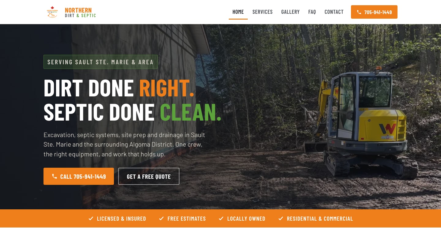
The situation
Trades businesses in Northern Ontario live and die by the phone. Work arrives through word of mouth, a Facebook page, and whoever shows up first in local search when someone’s septic backs up on a Saturday.
Northern Dirt & Septic had the crew, the equipment and the reputation. What they didn’t have was a front door: somewhere a homeowner could land, confirm these were the right people, and get in touch within about ten seconds.
A call-first site
The whole layout is built around one action: get in touch, immediately.
- The phone number is a persistent, tappable control in the header at every screen size. On mobile, where nearly all of this traffic lives, it never scrolls out of reach.
- Plain-language services. Excavation, basement digs, trenching, water and sewer, concrete pad prep, retaining walls. Named the way a customer would say them, not the way a contractor would invoice them.
- A three-step process section. Consultation, equipment on site, finished grade. Most quote hesitation is uncertainty about what actually happens; this answers it before anyone has to ask.
- Trust signals above the fold. Licensed and insured, free estimates, locally owned, residential and commercial. The things a homeowner checks before dialing.
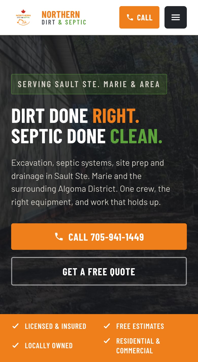
Mobile is the real design target. The call button sits above everything else and stays there.
A quote form that scopes the job
Not everyone wants to call, and the ones who don’t were previously lost. The quote form captures what the crew actually needs to price work: job type, location, and the details that otherwise take three phone calls to establish. A quote can be shaped before anyone drives out to look.
The part that isn’t a website
The interesting problem wasn’t the marketing site. It was what happens afterwards.
A contractor who pays someone to build a site usually ends up paying that same person every time a price changes, a service is added, or a photo of last week’s job should go in the gallery. Most of them stop asking, the site goes stale, and within a year it’s actively misrepresenting the business.
So the site ships with a custom CMS built for one specific non-technical owner, not a general-purpose admin panel with a hundred settings. Two tabs. Photos and services. That’s the whole thing, because that’s what this business actually changes.
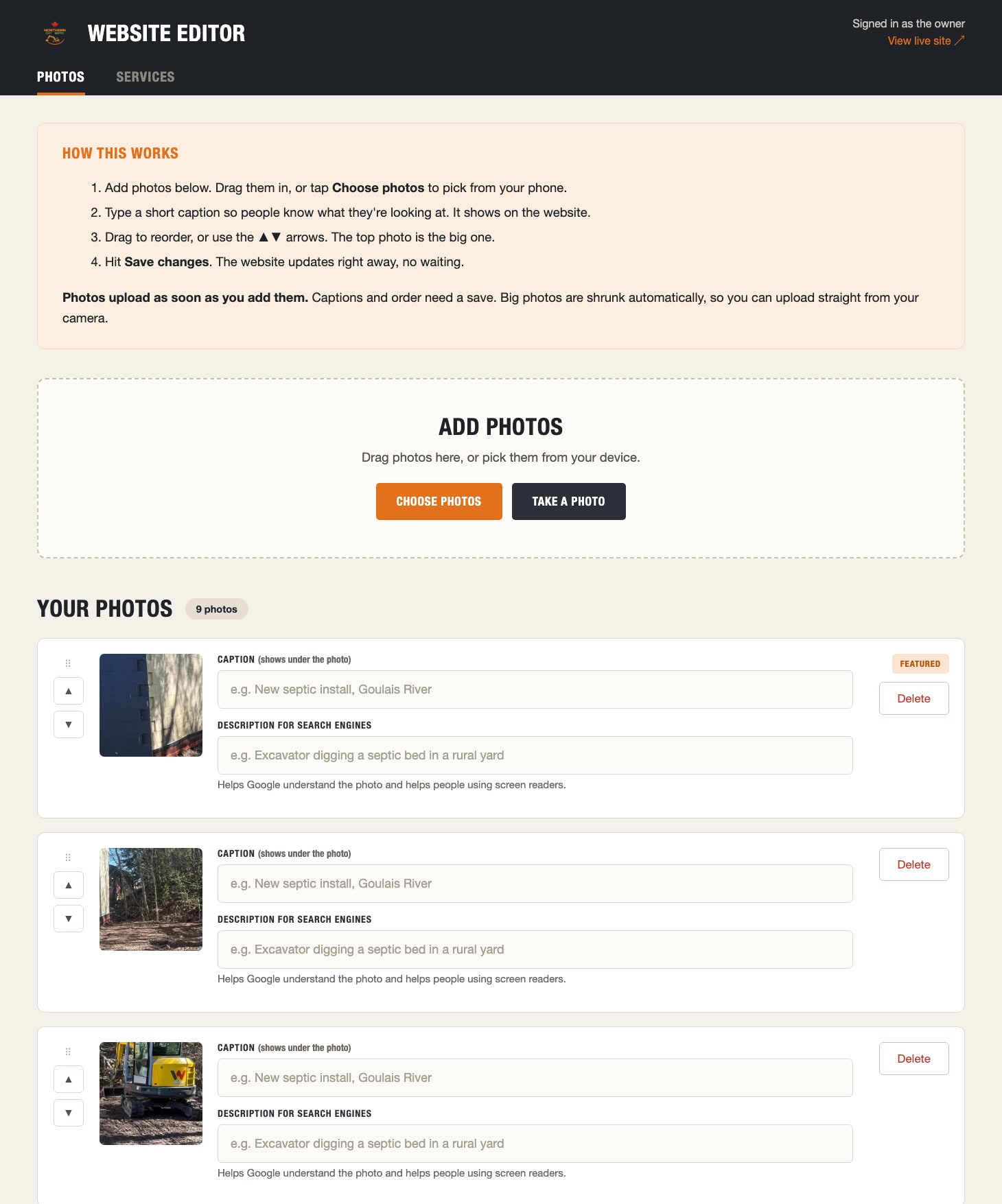
The photos tab. Every screen opens with a “how this works” panel written the way you’d explain it standing next to someone.
Most of the design decisions here are about removing anxiety rather than adding capability:
- “Take a photo” sits next to “Choose photos.” The person updating this is more often standing on a finished job than sitting at a desk. Photos are resized on upload, so shooting straight from a phone camera just works.
- Photos upload immediately; captions and order need a save. The panel says so in exactly those words. The worst feeling in a CMS is not knowing whether the thing you just did counted.
- Two caption fields, and the second one explains itself. “Description for search engines… helps Google understand the photo and helps people using screen readers.” Alt text usually goes unwritten because nobody explains why it matters. Here the field says why, in the field.
- Reorder arrows next to the drag handle. Dragging is fine on a desktop and miserable on a phone in a truck.
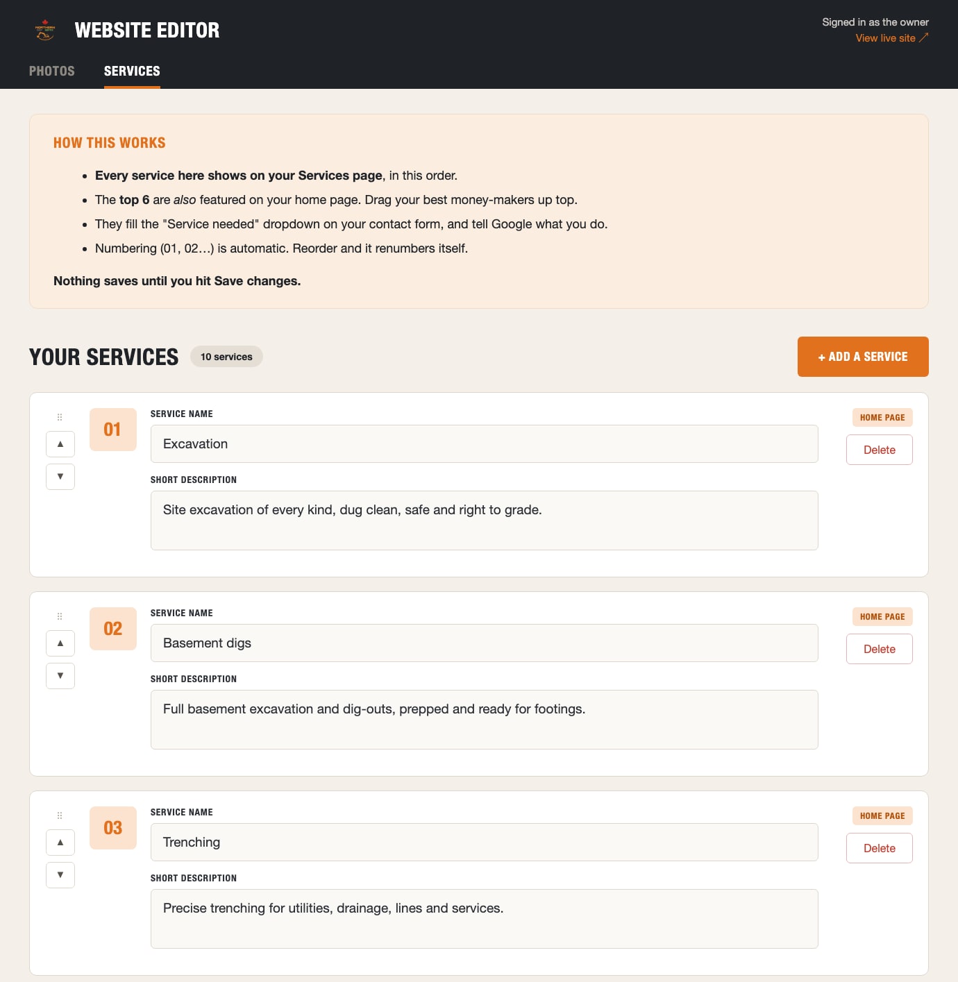
The services tab. Ordering is the only control, and it drives four things at once.
The services tab is where the idea pays off. One ordered list feeds the services page, the top six slots on the home page, the “Service needed” dropdown on the contact form, and the structured data that tells Google what this business does. The owner never learns any of that. They drag their best money-makers up top, which is how the instructions actually phrase it, and the numbering renumbers itself.
There’s no page builder, no drag-and-drop canvas, no theme settings, and no way to break the layout. The design stays consistent because the CMS only ever exposes content, never presentation.
That’s the actual deliverable. The site is what customers see; the CMS is what keeps it true six months later without a retainer, a WordPress admin, or a plugin that needs updating.
Why it’s built this way
There’s no framework doing heavy lifting on the client. The site is static files on a CDN, which means it loads fast on a phone with two bars of signal in the bush, which is exactly where a lot of these customers are standing when they decide to call someone.
That constraint drove most of the decisions. No carousel. No modal. No cookie banner to dismiss before you can find the phone number.
It also drove what isn’t here. No WordPress, no plugin stack, no monthly hosting bill, and no database to keep patched. A static site on a CDN and a small editor in front of it costs effectively nothing to run, and there’s no version of it that gets hacked through an out-of-date plugin while nobody’s looking. For a business that just wants the phone to ring, the cheapest and most reliable thing is also the simplest one.