Modco Media
A pacing dashboard that catches budget drift before month end
Internal tool for a media agency pacing roughly $1M of monthly ad spend across sixteen accounts. Surfaces the ones drifting off budget while there's still a month left to correct them.
Outcomes
The situation
An agency running paid media carries a specific, recurring risk: budget pacing. Every account has a monthly number it is supposed to land on. Spend too slowly and the client’s money goes unspent and unattributed. Spend too quickly and you are having an awkward conversation on the 24th.
Across a book of accounts, each with multiple channels, that is a lot of arithmetic to redo every morning. It normally gets done in a spreadsheet, which means it gets done well when someone has time, and not at all when they don’t. The failure mode isn’t a wrong number. It’s a number nobody looked at until it was too late to correct.
What it does
One screen that answers a single question: which accounts need me today?
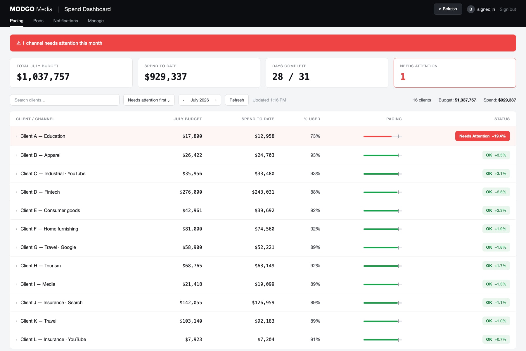
- Pace, not just spend. Every account is measured against where it should be given how much of the month has elapsed. The “days complete” figure drives the whole comparison, and 73% spent isn’t good or bad until you know it’s day 28.
- Sorted by exception. The default ordering puts anything off-pace at the top. On a normal day the useful part of this page is the first two rows.
- Per-channel breakdown. Accounts expand to show individual channels, so a book that looks fine in aggregate still surfaces the one channel that stalled.
- Status at a glance. A pacing bar with a target marker, and a signed variance percentage. Green is not “spent a lot,” it’s “on track.”
A live month, with client names replaced by sector labels. Roughly $1M of monthly spend across sixteen accounts, and on this day exactly one of them needed a human.
Why it’s a dashboard and not a report
The agency already had reporting. Reporting tells you what happened, accurately, after it happened. That is the wrong shape of tool for pacing, where the entire value is in the window where you can still act.
So this optimises for a different thing: it should take about four seconds to read, and it should be boring almost every day. A tool that demands attention daily gets ignored within a month. A tool that stays quiet until something is actually wrong gets trusted.
That also drove the notification design. Alerts fire on the exception, not on a schedule, because a daily digest that says “everything is fine” trains people to delete it unread.
Now available to other agencies
This started as one agency’s internal tool and turned out to be the same problem everywhere. It is now packaged so it can be deployed into an agency’s own Cloudflare account, with their repository and their data.
Note on the data
Client names are replaced with sector labels throughout. Those relationships belong to the agency, not to me. The budgets and spend figures are real, which is the part that matters here: this is a tool holding about a million dollars a month of live media spend, not a demo with invented numbers.